MasterDetail component can have hundreds of different looks. It's not limited to wizard like look as PrimeFaces wizard. A typically markup structure looks as follows:
<pe:masterDetail level="#{masterDetailBean.currentLevel}">

    <pe:masterDetailLevel level="1" levelLabel="Sports">
        <p:dataTable id="sports" value="#{masterDetailBean.sports}" var="sport">
            <p:column headerText="Sport">
                <p:commandLink value="#{sport.name}">
                    <pe:selectDetailLevel contextValue="#{sport}"/>
                </p:commandLink>
            </p:column>
        </p:dataTable>
    </pe:masterDetailLevel>

    <pe:masterDetailLevel level="2" contextVar="sport" levelLabel="Countries having #{sport.name} leagues">
        <p:dataTable id="countries" value="#{sport.countriesWithLeague}" var="country">
            <p:column headerText="Country">
                <p:commandLink value="#{country.name}">
                    <pe:selectDetailLevel contextValue="#{country}"/>
                </p:commandLink>
            </p:column>
        </p:dataTable>
    </pe:masterDetailLevel>

    <pe:masterDetailLevel level="3" contextVar="country" levelLabel="#{country.sport} leagues of #{country.name}">
        <p:commandButton value="Go to Sports">
            <pe:selectDetailLevel level="1"/>
        </p:commandButton>
        <p:commandButton value="Go to Countries">
            <pe:selectDetailLevel step="-1"/>
        </p:commandButton>
    </pe:masterDetailLevel>

</pe:masterDetail>
You see that each level has a required "level" attribute. Value of "level" attribute should be unique. Navigation by SelectDetailLevel gives a flexible and powerful capability to control partial validation and to call standard action / actionListener during navigation. SelectDetailLevel can pass context values (any objects) from level to level and make them available via context variables. Level to go to can be set via "level" or "step" attribute (default is step=1 if nothing specified). Text for breadcrumb items is set by "levelLabel" attribute or "label" facet of MasterDetailLevel component.Area to be updated / processed during navigation between levels is set automatically to the MasterDetail component - no needs to specify it in "process" / "update" attributes of command component SelectDetailLevel is attached to. But of course, this area can be also controlled more precise by "update" / "process" attributes. Partial validation can be e.g. skipped by setting process="@none" or immediate="true". Partial validation in case of the navigation via breadcrumbs is always skipped automatically. Other features are a server-side listener invoking when a navigation attempt takes place, "header", "footer" facets, implicitly navigation without pe:selectDetailLevel and more.
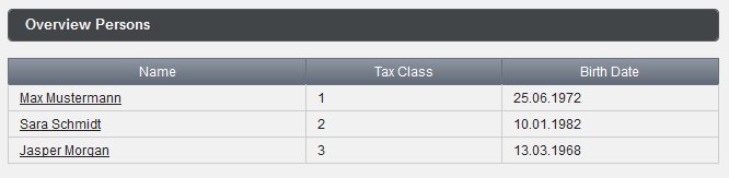
Next two screenshots show an example with two levels. The first level is a overview table with all persons. The second level represents a detail view to current selected person.

The next screenshot shows another use case with a custom header area. Built-in breadcrumb is replaced by wizard like visual steps.

This can be achieved by this code:
<pe:masterDetail level="#{masterDetailBean.currentLevel}" showBreadcrumb="false">
    <f:facet name="header">
        <pe:messages showDetail="true"/>
        <h:panelGroup layout="block" style="margin-top: 10px;">
            <h:panelGroup styleClass="levelTitle ui-state-default ui-corner-all
                          #{masterDetailBean.currentLevel eq 1 ? 'ui-state-hover' : ''}">
                <h:outputText value="Personal"/>
            </h:panelGroup>
            <h:panelGroup styleClass="levelTitle ui-state-default ui-corner-all
                          #{masterDetailBean.currentLevel eq 2 ? 'ui-state-hover' : ''}">
                <h:outputText value="Address"/>
            </h:panelGroup>
            <h:panelGroup styleClass="levelTitle ui-state-default ui-corner-all
                          #{masterDetailBean.currentLevel eq 3 ? 'ui-state-hover' : ''}">
                <h:outputText value="Contact"/>
            </h:panelGroup>
            <h:panelGroup styleClass="levelTitle ui-state-default ui-corner-all
                          #{masterDetailBean.currentLevel eq 4 ? 'ui-state-hover' : ''}">
                <h:outputText value="Confirmation"/>
            </h:panelGroup>
        </h:panelGroup>
    </f:facet>

    <pe:masterDetailLevel level="1">
        ...
    </pe:masterDetailLevel>

 ... more levels ...

</pe:masterDetail>
Check the PrimeFaces Extensions showcase please to get more source code. You can see especially the case with a server-side selectLevelListener which allows to control the level to be navigated (success vs. error case).
That's a pretty cool and interesting component Oleg! Nice job :)
ReplyDeleteMany thanks Arjan for your reply. I could not describe all use cases in this short post, especially with SelectLevelListener and SelectLevelEvent. Pretty thing is that this component is heavy used in production and is well tested.
ReplyDeletehi Oleg
ReplyDeletehow we can put Steps personal,address,contact confirmation in left side
can you give example.
thanks
Kuldeep
On the left side? It sounds as a left oriented PrimeFaces TabView. I think you can try to use TabView with left orientation http://www.primefaces.org/showcase-labs/ui/tabviewOrientation.jsf in the header facet of MasterDetail. Just set a proper activeIndex which depends on selected level (see my example with masterDetailBean.currentLevel).
ReplyDeleteHi Oleg
Deletei tried but it is not working.i tried to put tabView in between but instead of going left side,it is displaying like this
Personal
Address
contact
Confirmation
----------------------------
|Personal Details |
| |
| |
| |
---------------------------
so all master Details steps are displaying as top to down,
i want to show like this,i want to use masterdetail component only
Personal ------------------------------
Address | Personal Details |
contact | |
Confirmation | |
-------------------------------
pls help
thanks
Kuldeep
Hi Oleg. I tried to change level/step on a masterDetail from a commandButton outside of the masterDetail, but did not know how. Please help.
ReplyDelete
ReplyDelete....
...
....
...
Allways update Form, no is dynamic update. is necesary manual update
Can you navigate to another page after the last master detail level?
ReplyDeleteHey guys I implement this Code .. Found this error plz can help me : java.lang.NoClassDefFoundError: org/primefaces/util/ComponentTraversalUtils
ReplyDeletePlease check the versions of PF und PF Extensions. They should be compatible. You can find the compatibility hints in Release Notes https://github.com/primefaces-extensions/primefaces-extensions.github.com/wiki/Release-Notes
Delete